
Drawing the night network
After midnight, a city's transit map turns into a different city. How we redrew Vesterby's night buses so the map matches the network riders actually have.


On this page5 sections
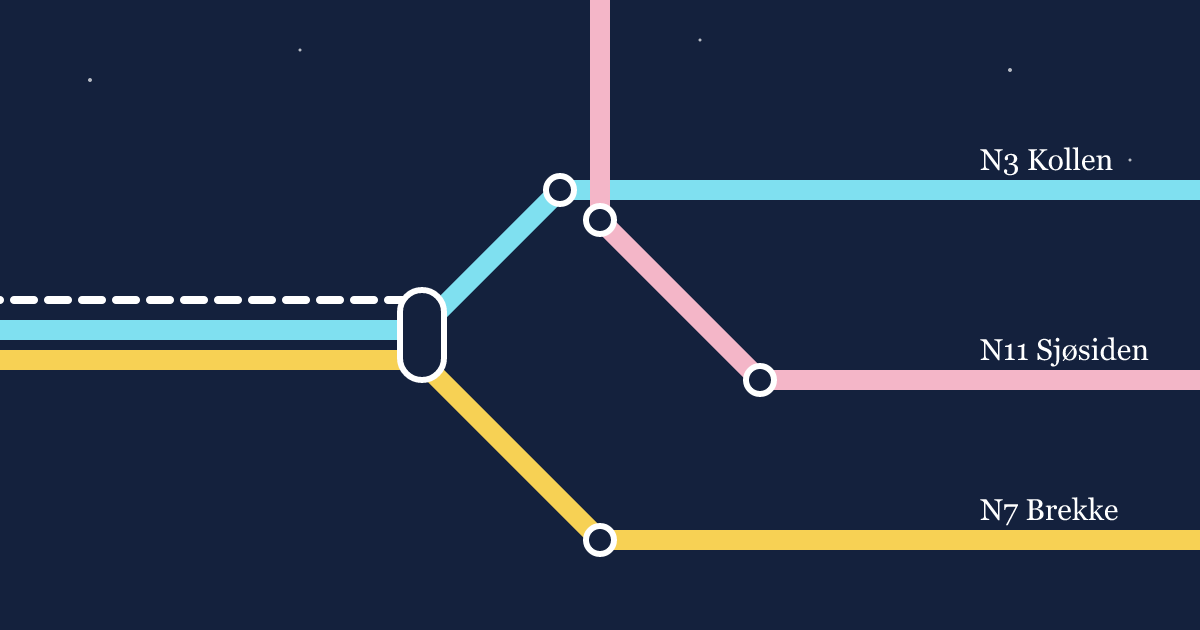
Vesterby runs 14 night bus lines between midnight and 5 a.m. Until this summer, they appeared on the same map as the day network, printed in dark blue on top of everything else. Riders at 2 a.m. had to read a map of 61 lines to find the 14 that existed.
The transit authority asked us for a separate night map. This is how we drew it.
Start from the trips, not the lines
We began with a week of tap-in data from 00:00 to 05:00. Night trips look nothing like day trips. They run outward, from the centre and the hospital district to the edges, and most of them are one-way. Almost nobody changes buses.
That changed what the map had to do. A day map helps riders change lines. A night map has to help one person find one bus home, fast, under a single streetlight.
At night, the map’s job shrinks to one question: which bus gets me home from here?
Bigger, fewer, darker
We made three changes that would be wrong on a day map.
- Terminus names doubled in size. Riders identify a night bus by where it ends, not by its number.
- Only stops with a shelter or a lit pole. We cut 40% of the stops from the map. They’re still served, but we’d rather riders wait somewhere visible.
- A dark map by default. The poster is printed white on deep navy, which also makes it readable under the orange street lamps at most stops.
The geography problem
Night buses go further than day lines, often 20 km out to villages the day map doesn’t show. Drawn at the same scale as the centre, the outer ends ran off the poster. Drawn as a pure diagram, they made a 40-minute ride look like three stops.
Tomasz solved it with two scales on one sheet. The centre, where riders board, is a dense diagram with every lit stop. Outside the ring road, each line becomes a single thin stroke with only its timing points and the minutes from the centre printed beside them. Riders told us this was the part of the map they used most, because it answered the question they actually had at the stop: how long until I’m home?
Colour that survives the dark
Most of our day palette fails under sodium lamps. Reds and oranges go brown, greens go grey. Hal tested 30 swatches on printed posters at three real stops, at 1 a.m., with a phone camera and his own eyes.
Kept
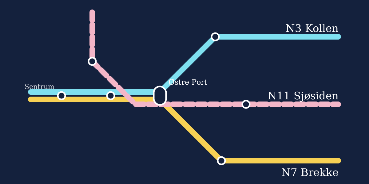
Light cyan, warm yellow, white and a pale pink held up under every lamp type we tried.
Dropped
Dark red, forest green and purple all read as the same muddy grey at 3 metres.
With only four colours that work, 14 lines need another way to tell themselves apart. We added a pattern to each line, solid, dashed or double, so two lines with the same colour never cross the same stop.
What riders told us
The map went up at 220 stops in July. In August we interviewed 85 night riders. Seventy said they found their bus in under a minute. The most common complaint was a fair one: the map didn’t show when the last day bus leaves, so riders couldn’t tell if they had to wait for the night service at all. The October edition adds it.